Create reusable button Components with React,Typescript , Tailwind and Tailwind-variants

I create professional and fast web experiences using tools like Html, Css, Tailwind CSS, Javascript (React js, Next js), Typescript, and Git/Github. Leveraging these tools, and others, I create scalable and reliable websites and Web applications with good user interfaces and user experiences.
So, You write a few components here and there and have written some button components of your own. But then your button components are not flexible and reusable enough, and you end up rewriting a lot of logic and styles within your react components trying to make it fit different cases in different parts of your application,
Well, you are in the right place. This article serves as an easy-to-follow guide on how to create a reusable and flexible button component using React, Typescript, Tailwind CSS, and the Tailwind-variant package.
Prerequisites
As mentioned above, we will be using React, Typecript, and Tailwind CSS when building our components, so basic knowledge of creating components using these will help you better understand how things work together. of course, if u have not used Tailwind CSS before, you are welcome to follow along as Tailwind is straightforward.
Project Setup
Now let's set things up so we can start building our component. we will start by creating a simple React + Typescript + Tailwind CSS project.
Create a simple React project with Vite:
npm create vite@latest
Follow the prompts to finish the setup process.
Setup Tailwind in the project:
Visit the Tailwind website and follow the simple installation guide here
Install tailwind-variants:
npm install tailwind-variants
Tailwind Variants is a first-class variant API library for Tailwind CSS. it helps us create variants of UI components that could be based on a design system easily.
Creating Button Styles
Now that we are done setting everything up, we can go ahead and start setting the base styles for the button component. create a components folder, in the src folder of your application. Add a button folder and add 2 files in this folder: a Button.tsx file which is our main button component and a ButtonStyles.ts file which will hold all our button style variants. You should end up with something like this:

Great. now let's drive into the ButtonStyles.ts components and add some basic button styles.
We are going to create a baseButton variant, this variant will contain all the base styles that every button should have. We do this by importing tv from tailwind-variants, passing it an object containing our styles, and assigning that to the baseButton constant
import { tv } from 'tailwind-variants';

export const baseButton = tv({
  base: 'text-center relative font-semibold whitespace-nowrap align-middle outline-none inline-flex items-center justify-center select-none',
  variants: {
    size: {
      xs: 'text-xs py-1 px-2',
      md: 'text-sm py-2 px-4',
      lg: 'text-base py-3 px-6',
      xl: 'text-lg py-4 px-8',
      xxl: 'text-xl py-5 px-10',
      square_xs: 'text-xs h-4 w-4 p-1',
      square_sm: 'text-sm h-6 w-6 p-1',
      square_md: 'text-base h-8 w-8 p-1',
      square_lg: 'text-lg h-10 w-10 p-1',
      square_xl: 'text-xl h-12 w-12 p-1',
    },
    vPadding: {
      xs: 'py-[4px]',
      sm: 'py-[8px]',
      md: 'py-[12px]',
      lg: 'py-[16px]',
    },
    vSpace: {
      xs: 'my-1',
      sm: 'my-2',
      md: 'my-4',
      lg: 'my-6',
    },
    HSpace: {
      xs: 'mx-1',
      sm: 'mx-2',
      md: 'mx-4',
      lg: 'mx-6',
    },
    align: {
      center: 'mx-auto',
      right: 'ml-auto',
      left: 'mr-auto',
      top: 'mb-auto',
      bottom: 'mt-auto',
    },
    rounded: {
      none: 'rounded-none',
      xs: 'rounded-[2px]',
      sm: 'rounded-[4px]',
      normal: 'rounded-[8px]',
      lg: 'rounded-[12px]',
      full: 'rounded-full',
    },
    behavior: {
      block: 'w-full',
    },
  },
});
Nice!!, we now have some base styles for our buttons. let's go ahead and create a solid button variant with 4 colors: Green, Teal, Yellow, and Gray
// create solid button styles
export const solidButton = tv({
  extend: baseButton,
  variants: {
    color: {
      green:
        'bg-[#58cc02] text-gray-100 shadow active:shadow-none active:translate-y-[5px]',
      teal: 'bg-[#0D9488] text-gray-100 shadow-teal active:shadow-none active:translate-y-[5px]',
      yellow:
        'bg-[#FFC700] text-gray-100 shadow-yellow active:shadow-none active:translate-y-[5px]',
      gray: 'bg-[#64748B] text-gray-100 shadow-blueGray active:shadow-none active:translate-y-[5px]',
    },
  },
});
We extend all the variants and styles from the base button and then add custom variants that will apply to solid buttons. this means a solid button will have a color, and size, can be rounded, and have all the other properties from the baseButton. For the custom shadow, I added new box-shadow variables in my tailwind config.
/** @type {import('tailwindcss').Config} */
export default {
  content: ['./index.html', './src/**/*.{js,ts,jsx,tsx}'],
  theme: {
    boxShadow: {
      DEFAULT: '0 3px 0 #57a300',
      teal: '0 3px 0 #0F766E',
      yellow: '0 3px 0 #E49E00',
      blueGray: '0 3px 0 #475569',
      none: 'none',
    },
    extend: {},
  },
  plugins: [],
};
Now, when creating button components, there are several things we need to in mind:
We want our button to extend the attributes of the native HTML button tag
We want the variant styles to be applied to our button
We might want to be able to override button variant styles with custom styles via the className attribute
With all these in mind, our Button component will look something like this
/* eslint-disable react/jsx-props-no-spreading */
import { forwardRef, useMemo } from "react";
import { type VariantProps } from "tailwind-variants";
import { TbLoader } from "react-icons/tb";
import { outlineButton, solidButton,ghostButton } from "./ButtonStyles";

// define all the button attributes
type BaseButtonAttributes = React.ComponentPropsWithoutRef<"button">;

// define the ref type
type Ref = HTMLButtonElement;

// extend the base button attributes
interface ButtonProps extends BaseButtonAttributes {
  isLoading?: boolean;
  disabled?: boolean;
  leftIcon?: React.ReactElement;
  rightIcon?: React.ReactElement;
  buttonStyle?: VariantProps<typeof solidButton |typeof outlineButton|typeof ghostButton>;
  className?:string,
  buttonVariant?: "solid" | "outline" | "ghost";
}

const Button = forwardRef<Ref, ButtonProps>((props, ref) => {
  // destructure neccesary props
  const { type, children, buttonStyle, buttonVariant, disabled, isLoading, leftIcon, rightIcon,className, ...rest } = props;

  // determine icon placement
  const { newIcon: icon, iconPlacement } = useMemo(() => {
    let newIcon = rightIcon || leftIcon;

    if (isLoading) {
      newIcon = <TbLoader className="animate-spin" size={25} />;
    }

    return {
      newIcon,
      iconPlacement: rightIcon ? ("right" as const) : ("left" as const),
    };
  }, [isLoading, leftIcon, rightIcon]);

  const renderButtonVariant=()=>{
    if(buttonVariant==="solid"){
      return solidButton({...buttonStyle,className})
    }
   }

  return (
    <button
      className={renderButtonVariant()}
      {...rest}
      type={type ? "submit" : "button"}
      ref={ref}
      disabled={disabled || isLoading}
    >
      {/** render icon before */}
      {icon && iconPlacement === "left" ? (
        <span className={`inline-flex shrink-0 self-center ${children && !isLoading && "mr-2"}`}>{icon}</span>
      ) : null}

      {/** hide button text during loading state */}
      {!isLoading && children}

      {/** render icon after */}
      {icon && iconPlacement === "right" ? (
        <span className={`inline-flex shrink-0 self-center  ${children && !isLoading && "ml-2"}`}>{icon}</span>
      ) : null}
    </button>
  );
});

// set default props
Button.defaultProps = {
  buttonStyle: {},
  buttonVariant: "solid",
  isLoading: false,
  disabled: false,
  leftIcon: undefined,
  rightIcon: undefined,
};

export default Button;
that's a lot of code, but don't worry, let's get a closer look at some parts of this Button component.
Button Props
// define all the button attributes
type BaseButtonAttributes = React.ComponentPropsWithoutRef<"button">;

// extend the base button attributes
interface ButtonProps extends BaseButtonAttributes {
  isLoading?: boolean;
  disabled?: boolean;
  leftIcon?: React.ReactElement;
  rightIcon?: React.ReactElement;
  buttonStyle?: VariantProps<typeof solidButton>;
  className?:string,
  buttonVariant?: "solid";
}
Here, we define the basic props of the component. our ButtonProps is an interface that extends all the attributes of a button e.g. onClick, ref, type, and more. taking a closer look at this we see the buttonStyle prop and buttonVariant prop. The buttonStyle prop is used to set various styles for a button which we defined in the ButtonStyles.ts file e.g. size, color, rounded, and more. Thanks to Typescript, we get amazing intellisence for this when working with our Button.
Rendering Icons
  // determine icon placement
  const { newIcon: icon, iconPlacement } = useMemo(() => {
    let newIcon = rightIcon || leftIcon;

    if (isLoading) {
      newIcon = <TbLoader className="animate-spin" size={25} />;
    }

    return {
      newIcon,
      iconPlacement: rightIcon ? ("right" as const) : ("left" as const),
    };
  }, [isLoading, leftIcon, rightIcon]);
Here we use the useMemo hook to run an anonymous arrow function that returns the icon passed to our button and its placement.
Great!!, now we have set up our Button component and we are ready to call it in another component and render some buttons.
Rendering Button
In my App.tsx component I import my Button component and call it like so:
 <div className="p-6 space-x-4 flex-wrap">
        <Button buttonStyle={{ color: 'green', rounded: 'lg', size: 'md' }}>
          Button
        </Button>
        <Button buttonStyle={{ color: 'teal', rounded: 'lg', size: 'md' }}>
          Button
        </Button>
        <Button buttonStyle={{ color: 'yellow', rounded: 'lg', size: 'md' }}>
          Button
        </Button>
        <Button buttonStyle={{ color: 'gray', rounded: 'lg', size: 'md' }}>
          Button
        </Button>
results :

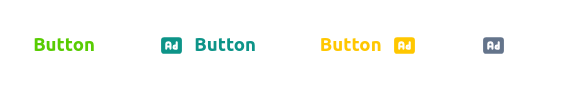
Nice!! , we have rendered 4 buttons with different colors. now let's create more Button variants called an Outline Button and Ghost Button.
In our ButtonStyles.ts we will add these button variants
//create outline button styles
export const outlineButton = tv({
  extend: baseButton,
  base: 'ring-1',
  variants: {
    color: {
      green:
        'ring-[#58cc02] text-[#58cc02] shadow active:shadow-none active:translate-y-[5px]',
      teal: 'ring-[#0D9488] text-[#0D9488] shadow-teal active:shadow-none active:translate-y-[5px]',
      yellow:
        'ring-[#FFC700] text-[#FFC700] shadow-yellow active:shadow-none active:translate-y-[5px]',
      gray: 'ring-[#64748B] text-[#64748B] shadow-blueGray active:shadow-none active:translate-y-[5px]',
    },
  },
});

//create ghost button styles
export const ghostButton = tv({
  extend: baseButton,
  variants: {
    color: {
      green: 'text-[#58cc02]',
      teal: 'text-[#0D9488]',
      yellow: 'text-[#FFC700]',
      gray: 'text-[#64748B]',
    },
  },
});
Again, this is very similar to our Solid Button variant. But our styles for the various colors have changed. With this, we can make use of these new variants in our buttonStyle prop, and also modify our buttonVariant prop to have our new variants
// extend the base button attributes
interface ButtonProps extends BaseButtonAttributes {
  isLoading?: boolean;
  disabled?: boolean;
  leftIcon?: React.ReactElement;
  rightIcon?: React.ReactElement;
  buttonStyle?: VariantProps<typeof solidButton |typeof outlineButton|typeof ghostButton>;
  className?:string,
  buttonVariant?: "solid" | "outline" | "ghost";
}
and our renderButtonVariant function now looks like this:
 const renderButtonVariant=()=>{
    if(buttonVariant==="solid"){
      return solidButton({...buttonStyle,className})
    }
    if(buttonVariant==="outline"){
      return outlineButton({...buttonStyle,className})
    }
    return ghostButton({...buttonStyle,className})
  }
Now let's render some new Button variants in our App.tsx component
 <div className="p-6 space-x-4">
        <Button
          buttonStyle={{ color: 'green', rounded: 'lg', size: 'md' }}
          buttonVariant="outline"
        >
          Button
        </Button>
        <Button
          buttonStyle={{ color: 'teal', rounded: 'lg', size: 'md' }}
          buttonVariant="outline"
        >
          Button
        </Button>
        <Button
          buttonStyle={{ color: 'yellow', rounded: 'lg', size: 'md' }}
          buttonVariant="outline"
        >
          Button
        </Button>
        <Button
          buttonStyle={{ color: 'gray', rounded: 'lg', size: 'md' }}
          buttonVariant="outline"
        >
          Button
        </Button>
      </div>
 <div className="p-6 space-x-4">
        <Button
          buttonStyle={{ color: 'green', size: 'md' }}
          buttonVariant="ghost"
        >
          Button
        </Button>
        <Button
          buttonStyle={{ color: 'teal', size: 'md' }}
          buttonVariant="ghost"
          leftIcon={<TbAdFilled size={20} />}
        >
          Button
        </Button>
        <Button
          buttonStyle={{ color: 'yellow', size: 'md' }}
          buttonVariant="ghost"
          rightIcon={<TbAdFilled size={20} />}
        >
          Button
        </Button>
        <Button
          buttonStyle={{ color: 'gray', size: 'md' }}
          buttonVariant="ghost"
          rightIcon={<TbAdFilled size={20} />}
        />
      </div>
results:

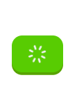
We can also try out different button states like the loading state
 <Button buttonStyle={{ color: 'green', rounded: 'lg', size: 'md' } isLoading >
  Button
 </Button>
results:
Overriding Styles
There might be situations where we might need to override our button styles, maybe we need that button just 2px wider or some other edge case has come up and you just need to modify a button without touching the base styles we set. We can easily do that with the className attribute
 <div className="flex p-6">
        <Button
          className="px-[100px]"
          buttonStyle={{
            color: 'green',
            rounded: 'lg',
            size: 'md',
            align: 'center',
          }}
        >
          Button
        </Button>
      </div>
and the button looks like this

Conclusion
Tailwind-variants provide a flexible approach to building modern components for our Tailwind CSS with Typescript projects. This is great, especially when building design systems using Tailwind CSS.
live code - stackblitz


